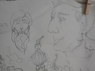
Here is a great example of the kind of visual art I like. It's got class, style, absurdity, and tentacles. Also, it is ink and engravings, which is hard to beat, in my book.
Check it out, yo: http://www.danhillier.com
The id is responsible for our basic drives such as food, sex and aggressive impulses. It is amoral and egocentric, ruled by the pleasure-pain principle; it is without a sense of time; completely illogical; primarily sexual; infantile in its emotional development; will not take 'no' for an answer. (Thanks, Wiki.)
25 May 2009
21 May 2009
Lost in the Dark
This week, my computer hard drive moved and did not leave a forwarding address. In the timeless wisdom of an idiot, I failed to make back up copies of almost anything from the last six months. This includes a fair amount of art, both original and reproduction. It is at times like this that I am glad I have made a habit, however sloppy and inconsistent, of posting my photos to the internet. Blogging may be one of the forms of poor mental hygiene, but at least it has a high Preserved For Posterity factor.
11 May 2009
07 May 2009
Two Heads and a Clown
Another unfinished painting

The larger, pink, swirly painting is unfinished. It needs more contrast. More.... red. Mostly. I think. I'll paint on it more when I know what.
This is closer to what I was trying to get with the blue one, but it's still not right. And I'm still not totally sure why. Also, I painted it two weeks ago, which means that I'm actually moving farther from my target. Whee.
The other painting is just to demonstrate that I've become that kind of artistic bum who piles things up any which way. (When I say "become" it makes it sound like I was not already a bum. Please go along with this, my mom might be reading.)
just a doodle
2/5

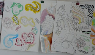
I'm less fond of this one. Well. I like the composition. Not happy with the green sphere. The yellow one isn't bad, although it didn't photograph as well as I would have liked.
I guess if I want better photos I'll have to use lights and a tripod and all that tedious crap...
Phylum:
chalk pastels,
painting,
watercolor,
win some lose some
Looks better in person...

... but still isn't GOOD. I don't know for sure what effect I'm trying to get, but I keep not getting it, so I keep trying again and again. It's a little frustrating, and my house is filling up with a wide variety of similar and similarly unsatisfying paintings... but I'm hoping someday I'll actually find what I'm after.
sweet swirl action

When I get too much into the subtle shading, I start feeling like Rothko, but then I put some real color into it and can go on living. Anyway, it was an experiment. I didn't like it.
Phylum:
failure,
oil,
painting,
scratchfile,
study,
test,
unfinished,
water-miscible oils,
win some lose some
That's right, it's time...

Time for one of my mass-uploads of recent stuff. Yeah, it'd obviously be just WAY too much effort to put them whenever I have put them up on the wall. Worse than calling the book-ordering place.
Out of spite, I'm beginning with a hand-written list entitled: A Partial Catalog of Things That Are Not Funny. Everything else will be images, though.
Subscribe to:
Comments (Atom)


