Showing posts with label win some lose some. Show all posts

04 September 2013

Recent Works On Paper. With Paper. Whatever.

Various permutations of block printing and embossing. The embossing made my brain tingle a little more than the printing, but where they are combined, that was pretty sweet, too. Not as easy to see in these photos, which were made with a telephone.
A heap of attempts. Some were more rewarding than others. It is difficult to tell if the ink is dorked, it was just too hot in the studio, or I don't know what I am doing. Or, you know, All of the Above.

These are cool enough, I figure they deserve large size! The two images were made from the same embossing plate, but the 2nd one had more carving done to it before going through the press. 

The purple is the same plate, block printed. I think this was one of the first prints I pulled with block printing ink. I tried intalio first to see if I liked it (yeah, yeah, I *know* that is not correct usage!) and I did like it, but the photos of those prints are pretty much impossible to decipher. 

07 July 2013

More Printing

Although things here have been a little chaotic, and also much, much too hot and dry, I have managed to get myself out to the studio a bit, and pull a few more prints. I think they are getting better, but I am no Master Printer. Yet.


This is the first print I have pulled of that acrylic dry point plate (that I posted about a couple of weeks ago). It is not so much composed as it is a collection of line sizes / weights / directions / etc. A sampler, if you will. There is so much new in this process for me that I most likely will claim every print as a test print for the next 30 years... This one looks especially funky because it does not fit totally on my scanner bed, and I did not want to mash it down, so the left side curved up and away, and seems blurry. In the actual print, it is not.


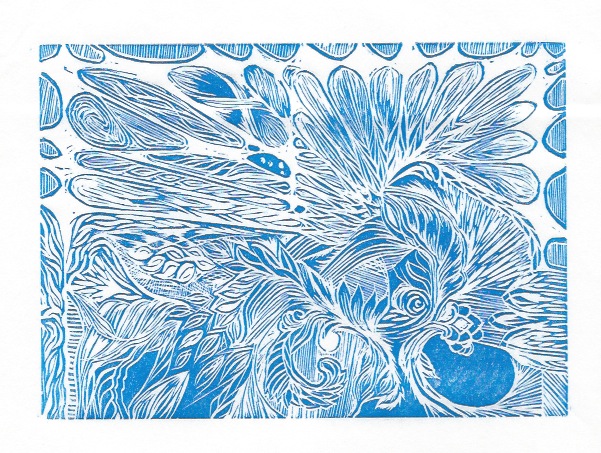
Revisiting these blocks. 

The two prints above are reprints of the same one I posted last week, with different technique, and the addition of retarder. Those both were beneficial changes to the process, I think.


This last one, however, actually has had a bunch of new cuts done to the block since last time I printed it. I tries printing this on top of prints I had already pulled (with the old cut), but this is a linocut, and the linoleum has become tremendously warped -- makes alignment / registration difficult. This print looks a little funny because the upper left corner is slightly over-inked, but also because this is a mixture of blue and black inks (plus retarder) just to see how that would go. I kinda like it, except the over-inked bit.

30 November 2010

What it looks like...


... not to sell art at the flea market. It's easy to think the display might've been a problem, but I assure you, that was not the difficulty. Most sellers seemed to simply have brought some stuff in a laundry basket and overturned it when they arrived at the flea market. The difficulty was, most of the people who were at the market looking for stuff were looking for specific things, and I don't think any of them were there looking for watercolor paintings. Most of those people were probably waiting for the Christmas market to open down in old town.

Wrong venue. Live and learn.

21 April 2010

2 steps forward..... 2 steps back.

I've been working on that wooden knot all week. Today's work centered around un-doing the work of the prevous two days. How's that for awesomesauce?

Curiously, I find I am OK with this, for a couple of very specific reasons. First, knowing how to correct screw ups is a valuable skill. Especially if one can correct them to the point of hiding all evidence of said screw ups. In this case, it's not a perfect cover up, but it's certainly going to be close enough for government work. And I don't go through life pretending screw ups don't happen, I'd rather know how to cope, than not.

Second, I shot myself in the foot by being hasty about what I was doing, and it cost me in time, effort, and result. Which means this time spent putting things back on track is also time I can spend figuring out a suitable course correction. Don't know if I'll actually learn any valuable lessons in patience, but it seems possible, and it seems like I can be happy with the outcome of this project. Historically, getting pissy and abandoning stuff when I screw up is my M.O.

So, no picture today, you can see yesterday's picture for a peek at what it will (once again) look like by the time I stop working on it today.

20 April 2010

2nd storage crate, done.

Here you see the finished crate, as well as the sketch from my sketch book about how I wanted it to look. It's not quite as depth-y as I'd considered, but that's OK. I like the flat, graphic style, too. There are a few things I'd do differently if I were to do this again.

For one thing, the blue paint was not waterproof. Cannot explain it. The white, black, and red were all waterproof, and they all came from the same pack of paint. I was also going for a 'distressed' look for the black upper/background area, but instead got 'splotchy'... ahh well. I think I lost patience when the blue paint turned on me, and I just kinda wanted the project to go away. Ended up having to roll some sealant over this, and it picked up blue paint. Irritating!


But I'm not doing this again. I'm going to do one of the other two crates awaiting decoration. I think the next one is going to be a stenciled repeater pattern. With metallic accents and racing stripe.

08 April 2010

... and then you threw an octopus at my window.


Been working on a variety of things, none of which are complete. Possibly as a consequence of multi-tasking? But paint has to dry, dammit! Here's one avenue I've been treading... dabbling in a combo of ink and watercolor that has been entertaining me.

Basically, the technique is to draw some lines/forms in non-waterproof ink, and then fill or not-fill the spaces with watercolor paint, which draws in some of the ink. It's a little blurrier than I'd like in some places, but some bits of it work quite well, I think. The top one is smallish, maybe a 5"x7" paper, and the top one is like a page of notebook paper size. I think I'll have more use for this technique in the future, I find it both satisfying to do as well as pleasing to have done. These are good things.

30 March 2010

A Sad Day

I had to return the scroll saw, it was crap. I need a good scroll saw. I am very disappointed.

26 November 2009

The Little Gloves That Couldn't


The thing about perfunctory research is that sometimes you begin the project and realize you're screwed. So it was with the gloves. Not only was my design for the gloves faulty in oh-so-many ways, but also, I kind of got carried away with the decoration on the gloves. The left on in particular. Also, the right glove. Oh well, it was fun anyway.

09 September 2009

The First Time Always Sucks


Here's my first go at this, from sketch to trace to wax to plaster model. I'm not even going to bother cleaning up the plaster. The wax isn't what I wanted (size constraint) and the mold making process did not go smoothly--the plaster is weak and crumbly and full of air holes. However, lessons were learned, and I'm hoping more lessons will be learned in the near future. Especially looking forward to the lesson about how this is going to turn out just as awesome as I'd hoped.

Probably going to cast this in resin, in the end. Durable enough, available enough. Has ALL the advantages... :)

12 August 2009

If at first you don't succeed...

... keep making little disasters until you run out of paper/patience. Figured this was better than posting each one of these individually before they go in the bin. There are about 4 square inches of awesome up there. I maybe cut them out and glue them together. The detail on the pic isn't great, even if you click through, but that's OK, they look better that way. Promise.

04 August 2009

Monoprinting?

First try. Not bad, considering how poorly the next several turned out. I taped a pattern to a sheet of glass, and painted the design on the other side of the glass in watercolor. I tried to pull the print by placing heavy things on top of it all, with the paper being wet enough, I thought, to suck up the paint, most of which had already dried. This *might* have worked if I'd rubbed the paper with a smooth thing, instead of letting it sit--the paper tore a bit when I peeled it up, because it had adhered to the glass, instead of just taking the paint and running off with it.


This is the 2nd try. The paper was FAR too wet, and the paint was... unwilling. After this, I decided I should probably just go read about how to make watercolor monoprints at home without any print equipment, instead of screwing around wasting a lot of time, energy, paint, and paper. Oh, and enthusiam. For reasons I can't guess, I'm really into this idea right now.


After doing a bunch of reading about how watercolor monoprints can be made, I tried a few of the recommendations. All together. On one plate. As you can see, it made a relatively uniformly unattractive print. Those recommendations were: a thin base layer of hand soap as a release agent, rub the paper by hand for the transfer, use paper designed specifically for watercolor paint. Although totally uncool, it encouraged me anyway. I'm easy, I guess.


A print to give me hope! Water-based pens on the left, water soluble/watercolor crayon on the right. The unevenness of the transfer comes from me using a bone folder tool to rub the transfer over. If you click through to the full size pic, you'll see how that's not a very good way to lay the color down, even if it seemed good at the time. I don't have a brayer, or a rolling pin, or anything. Outsider art, baybee!


This is the first really successful test. The big pink blob is from the paper being a little too wet, but that also was informative. The ghost image at the top is a 2nd pull from the original drawing with easy-wash-out kid's pens. The really vibrant bits of this were added in after I pulled the print, with those same pens. The actual base print was made with watercolor crayons, though.

Matting project continues


Besides being off center, I'm not pleased with this arrangement, I think it probably needs a dark over-mat instead of light. But, whatever, I'll re-do it sometime. As more and more stuff gets matted, the more official things look.

22 July 2009

These aren't new, but...

These 5 paintings aren't new, but I just framed them last night. Framing them has revealed to me that I will be painting at least 2, and probably 3 new components for this set, because what's there either doesn't fit, or doesn't please me. That's just how it goes, I guess.

I've been stalling on framing these for 3 or 4 months, probably because I already knew I wasn't going to be happy, and didn't want to deal with it. Guess it's time to own up and finish it.

21 May 2009

Lost in the Dark

This week, my computer hard drive moved and did not leave a forwarding address. In the timeless wisdom of an idiot, I failed to make back up copies of almost anything from the last six months. This includes a fair amount of art, both original and reproduction. It is at times like this that I am glad I have made a habit, however sloppy and inconsistent, of posting my photos to the internet. Blogging may be one of the forms of poor mental hygiene, but at least it has a high Preserved For Posterity factor.

07 May 2009

2/5


I'm less fond of this one. Well. I like the composition. Not happy with the green sphere. The yellow one isn't bad, although it didn't photograph as well as I would have liked.

I guess if I want better photos I'll have to use lights and a tripod and all that tedious crap...

When I get too much into the subtle shading, I start feeling like Rothko, but then I put some real color into it and can go on living. Anyway, it was an experiment. I didn't like it.