Showing posts with label study. Show all posts

04 September 2013

Recent Works On Paper. With Paper. Whatever.

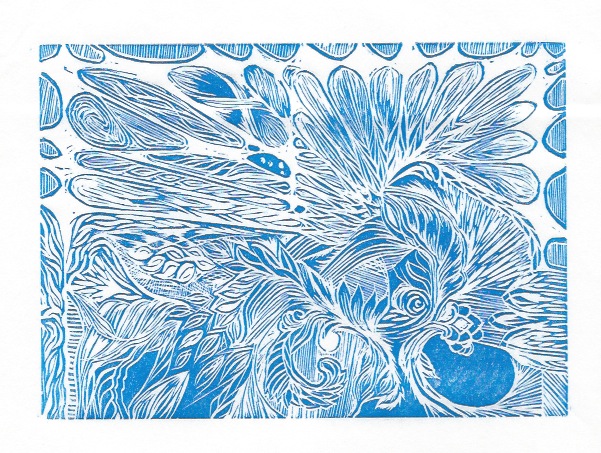
Various permutations of block printing and embossing. The embossing made my brain tingle a little more than the printing, but where they are combined, that was pretty sweet, too. Not as easy to see in these photos, which were made with a telephone.
A heap of attempts. Some were more rewarding than others. It is difficult to tell if the ink is dorked, it was just too hot in the studio, or I don't know what I am doing. Or, you know, All of the Above.

These are cool enough, I figure they deserve large size! The two images were made from the same embossing plate, but the 2nd one had more carving done to it before going through the press. 

The purple is the same plate, block printed. I think this was one of the first prints I pulled with block printing ink. I tried intalio first to see if I liked it (yeah, yeah, I *know* that is not correct usage!) and I did like it, but the photos of those prints are pretty much impossible to decipher. 

07 July 2013

More Printing

Although things here have been a little chaotic, and also much, much too hot and dry, I have managed to get myself out to the studio a bit, and pull a few more prints. I think they are getting better, but I am no Master Printer. Yet.


This is the first print I have pulled of that acrylic dry point plate (that I posted about a couple of weeks ago). It is not so much composed as it is a collection of line sizes / weights / directions / etc. A sampler, if you will. There is so much new in this process for me that I most likely will claim every print as a test print for the next 30 years... This one looks especially funky because it does not fit totally on my scanner bed, and I did not want to mash it down, so the left side curved up and away, and seems blurry. In the actual print, it is not.


Revisiting these blocks. 

The two prints above are reprints of the same one I posted last week, with different technique, and the addition of retarder. Those both were beneficial changes to the process, I think.


This last one, however, actually has had a bunch of new cuts done to the block since last time I printed it. I tries printing this on top of prints I had already pulled (with the old cut), but this is a linocut, and the linoleum has become tremendously warped -- makes alignment / registration difficult. This print looks a little funny because the upper left corner is slightly over-inked, but also because this is a mixture of blue and black inks (plus retarder) just to see how that would go. I kinda like it, except the over-inked bit.

17 December 2010

Old Dog / New Tricks

Took a two evening advanced course in acrylic abstract painting, with emphasis on landscape rendering. I went with a water theme, probably because I'd been listening to The Odyssey audio book all afternoon...

Although that style of painting does not especially interest me, the techniques presented did, and the instructor did a fine job of explaining them.

My canvas was, sadly, too small to try them all out at once, as most of them rely on allowing thin layers of paint dry between applications. Obviously this is tough with a small canvas! You can only get so far away from what you've just painted. Everyone else in the class was working with one or more canvasses in the 2'x3' size range, for the most part.

Here is the canvas I painted during class. Currently I have a couple of watercolors in progress, but when I have finished those, I am going to start some acrylic paintings. It seems that having a couple of canvasses going simultaneously is the cure for waiting, and I love trying new stuff. I did come out of the classes feeling pretty inspired to try these techniques, and full of ideas about how to put them to good use.

I admit it was hard not to giggle when several of the other course participants extended sincere sympathy to me, as an apparently obvious total beginner to painting. I took the small canvas (about a foot square) because I've not been feeling well lately, and didn't have a lot of energy for a large painting -- and I *hate* unfinished paintings. Also, carrying it to class and back home in the freezing damn cold on foot kinda sucks. $5 says everyone else in the class came in a car. Since I'd been doing watercolors during the day both days, I ended up painting the acrylic left-handed to give my right a break. Didn't really get into any of that with the other people in the class, though. I was just happy to be there.

There is a summer course, 3 days somewhere north of here, that I will probably sign up for, if I can work out transportation, and get registered before all the spots fill. It does look like fun.

29 June 2010

How These Things Begin (sort of)

Here's my sketch for the 16 windows of the
previous few posts. It's kind of similar, and
kind of ... gestural. Doing the drawing functioned more to give me the sense of what kind of lines I wanted the frames to have, than to give me the precise shapes for each of the 16 windows.

In some ways this stuff would all be easier if I were the type to plan my projects out to the last and tiniest detail before beginning to execute, but I have tried that in the past, and invariably been horribly, horribly frustrated. Because when I plan that way, I give myself no leeway for adapting to the unexpected. Materials or processes that don't work out quite as planned. When I do that much planning, I damn well expect it to work out like that!

On the other hand, when I do it this looser way, just kind of rolling with the ideas as they come, I tend to change course a bit *too* much, whether things are working or not, and I tend to waste time and effort and often materials. In this method, I have to be very careful to set firm deadlines and I have to set budget limitations, material limitations, and lock down how many changes I let myself make along the way. Project managing, basically. That turns into a tough line to toe, because it wars with my desire not to stifle creative urges. (The alternative being, frustration because my creative urges make it flat out impossible to get anything done, ever.)

08 April 2010

... and then you threw an octopus at my window.


Been working on a variety of things, none of which are complete. Possibly as a consequence of multi-tasking? But paint has to dry, dammit! Here's one avenue I've been treading... dabbling in a combo of ink and watercolor that has been entertaining me.

Basically, the technique is to draw some lines/forms in non-waterproof ink, and then fill or not-fill the spaces with watercolor paint, which draws in some of the ink. It's a little blurrier than I'd like in some places, but some bits of it work quite well, I think. The top one is smallish, maybe a 5"x7" paper, and the top one is like a page of notebook paper size. I think I'll have more use for this technique in the future, I find it both satisfying to do as well as pleasing to have done. These are good things.

01 February 2010

Sometimes when I do a design, I struggle and thrash to get a line Just So, and eventually either concede defeat, or erase the mofo out of spite.

In this case, I *thought* I had the lines right where I wanted them, and then as soon as I put my pencil down and hung the thing on the wall, I immediately saw where I'd gone wrong.

Maybe I'll re-do this with the lines in the right places. Maybe I'll actually DO SOMETHING with this design. But since I have no concrete plans for doing a project with this, my incentive to re-draw it with the lines right is also somewhat reduced.

Sorry about the color scheme. I was playing with white balance correct in my photo editing process, and sometimes it glitches and tells me one thing while actually doing another. This was supposed to be red, and it looked awesome. Oh well.

OK, so I lied.

Weeks ago, I made a noise about uploading some pictures of my recent design projects. And then I didn't do it. This should come as no surprise to anyone who has been keeping up with this blog...

Anyway, I took a bunch of pictures today, and as it always does, that made me want to work on some projects I'd done designs for and not actually made an object with.

The picture here is a sheet of embossing foil that I've drawing a bit of knotwork on/into. It's far too flimsy to do anything with, and also I've poked a bunch of holes it in with my embossing stylus. (Not to be confused with an out-of-ink ballpoint!)

Anyway, while I was playing with that, I figured it might be fun to make some kind of low relief thing like this, and then fill it with wax or plaster, making a small shiny object. I did some trials, to test the level of detail and so on, and even poured wax in, and got some small shiny objects out. So there is definitely more coming on that front. However--there are no pictures of that trial run, because I tossed all the 'evidence' in the trash. Scented votive candles are not the right source of wax for this kind of thing.

This was sort of meant to be a bookmark or something, but I'm not satisfied with it, so, it's probably going on the vast heap of Projects Which Taught Me Valuable Lessons About Something.

26 November 2009

2nd Go

After that first set of stitches, I decided to do something a little more cohesive--a general design picked out in white thread, and then filled with a variety of colors and techniques. I drew a little bit of this with a pencil, which got graphite all over my white thread. After that, I just went totally freehand, sewing the design directly on the unmarked linen.

But then after many, many, many hours of poking away at this, I decide it might be a little too ambitious. Especially as my skills with certain more complicated stitch patterns were lacking non-existent.

This was abandoned in favor of a few smaller practice bits. Sometimes I get too excited about a new thing, and forget that I'm new to it, and don't need to shoot the moon the first time.

By the way, if you click through to the larger size of this picture, you should be able to enlarge it even more from there. Possibly to the point of too much detail. The yellow sort of diamond-shaped bit shows particularly well my lack of awesomeness at this point.

Latest Fixation: Embroidery

Sometime in the past few months, I got hooked on the idea that embroidery and other sewing-related activities might be fun and visually entertaining.

(In case you ever wondered, my Big Artistic Mission is "make stuff that is interesting to look at"...)

So, I picked up one book about embroidery, and was handed the book from a starter kit. Between the two, and an 8 hour transatlantic flight, I was able to pick out a few tentative designs. At the very top (12 o'clock position) are the very first stitches I made. It pretty much had to get better from there...

15 September 2009

It's always so nice at the beginning.

As always, click for bigger.

This is the canvas I've just started a few days ago. It's not going to be B&W, I haven't even started painting yet. It's going to be acrylic paint. I really like the design, though. This is why I filled sketch book after sketch book, for years, with black line drawings, and consumed countless black Sharpies along the way... I'd start something like this, intending to color it in, and then fall in love with the B&W, and not be able to bear adding color. What if I didn't love it?!

Then I learned about photocopying...

This won't photocopy, though. It's 30cm x 150cm.

05 September 2009

Proof of Paint 2


I don't like it, exactly, at least not ALL of it, but I believe it gave me a good idea for the next thing. In any case, I'm done picking at it with the paintbrush.

04 August 2009

Success!

On the left is the printing plate-- a sheet of glass with a designed taped to the back side of it, so I know where to make marks. I've colored the design on the top of the glass with watercolor/water soluble crayons. It's faint, because I've already pulled a print from this. On the right is the print that I pulled. More vibrant than the plate, probably 2/3 of the color transferred. There is enough color left on the plate that I can pull one more very faint print without recoloring, or I can add more color and print again at full strength. Or, I can clean the glass and start over entirely.

This is a crap photo of the final print. It's successful because it is more or less exactly what I was trying to do. The coloration is a little weird and uneven, and not just because it's a low light photo. It's actually weird. The whole image could benefit from some additional paint/ink detailing, and I'm experimenting to find out how much of what's on the page is water soluble (ie, I can alter/move it around with just water), and how much is just pigment, which means it's basically part of the paper now, and everything else goes on top.

Also, if you find yourself wondering, What the hell IS monoprinting, anyway? ... Wiki to the rescue!

Monoprinting?

First try. Not bad, considering how poorly the next several turned out. I taped a pattern to a sheet of glass, and painted the design on the other side of the glass in watercolor. I tried to pull the print by placing heavy things on top of it all, with the paper being wet enough, I thought, to suck up the paint, most of which had already dried. This *might* have worked if I'd rubbed the paper with a smooth thing, instead of letting it sit--the paper tore a bit when I peeled it up, because it had adhered to the glass, instead of just taking the paint and running off with it.


This is the 2nd try. The paper was FAR too wet, and the paint was... unwilling. After this, I decided I should probably just go read about how to make watercolor monoprints at home without any print equipment, instead of screwing around wasting a lot of time, energy, paint, and paper. Oh, and enthusiam. For reasons I can't guess, I'm really into this idea right now.


After doing a bunch of reading about how watercolor monoprints can be made, I tried a few of the recommendations. All together. On one plate. As you can see, it made a relatively uniformly unattractive print. Those recommendations were: a thin base layer of hand soap as a release agent, rub the paper by hand for the transfer, use paper designed specifically for watercolor paint. Although totally uncool, it encouraged me anyway. I'm easy, I guess.


A print to give me hope! Water-based pens on the left, water soluble/watercolor crayon on the right. The unevenness of the transfer comes from me using a bone folder tool to rub the transfer over. If you click through to the full size pic, you'll see how that's not a very good way to lay the color down, even if it seemed good at the time. I don't have a brayer, or a rolling pin, or anything. Outsider art, baybee!


This is the first really successful test. The big pink blob is from the paper being a little too wet, but that also was informative. The ghost image at the top is a 2nd pull from the original drawing with easy-wash-out kid's pens. The really vibrant bits of this were added in after I pulled the print, with those same pens. The actual base print was made with watercolor crayons, though.

01 August 2009

Lotus concept sketch

Haven't done anything with this since completing this initial design, but I like it, so I put it up on the wall of designs I like that I haven't done anything with. It's getting kind of crowded over there. In fact, now that I've put this one up, there isn't really any more room on that wall. Guess I need to either do something with some of those designs, or stop making new ones...

14 July 2009

Just finished...

Just sprayed sealer on this. it's not bad, but it's not 100% what I wanted, either. The good news is, I think I know how to get what I wanted. Had a thought about that just as I was putting the last touches on this.

In case you were wondering, I'm pretty sure both the painting and the photograph are a little tilted, but when I mat this, I should be able to (mostly) correct that. I guess I'll find out...

07 May 2009

just a doodle


Just screwing around with ink & watercolor, washes, fills, silhouettes, etc. Quite like some of it, haven't figured out where/how to use it.

Looks better in person...


... but still isn't GOOD. I don't know for sure what effect I'm trying to get, but I keep not getting it, so I keep trying again and again. It's a little frustrating, and my house is filling up with a wide variety of similar and similarly unsatisfying paintings... but I'm hoping someday I'll actually find what I'm after.

When I get too much into the subtle shading, I start feeling like Rothko, but then I put some real color into it and can go on living. Anyway, it was an experiment. I didn't like it.

24 March 2009

Two days' worth...

This is a poor photograph if a watercolor study that I started yesterday. I may or may not actually complete it, there are a number of technical and compositional errors. And, besides that, it's just a study--I wanted to know how this would look, if I put a bit more depth into the mosaic style I was working with last year.

There is a great deal of potential in this, and I suspect this will lead to another composition of a more complete nature in the near future. I may even get ambitious and take a better picture of this one.

Or. You know. Not. You can never can tell with me. Unending surprises around here...

18 March 2009

Old Glass, New Sun

Danielle sent me some stuff from my life-before-2D, and one of those things was a bundle with 4 panels of stained glass that I made a while back. It's not any kind of great composition, just a technical exercise, really. But it made me happy to see it anyway. Who knows, maybe it makes you happy to see it, too.

The panels are about 3"x5" each.