Showing posts with label paper. Show all posts

04 September 2013

Recent Works On Paper. With Paper. Whatever.

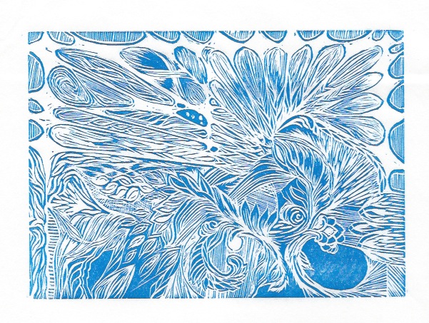
Various permutations of block printing and embossing. The embossing made my brain tingle a little more than the printing, but where they are combined, that was pretty sweet, too. Not as easy to see in these photos, which were made with a telephone.
A heap of attempts. Some were more rewarding than others. It is difficult to tell if the ink is dorked, it was just too hot in the studio, or I don't know what I am doing. Or, you know, All of the Above.

These are cool enough, I figure they deserve large size! The two images were made from the same embossing plate, but the 2nd one had more carving done to it before going through the press. 

The purple is the same plate, block printed. I think this was one of the first prints I pulled with block printing ink. I tried intalio first to see if I liked it (yeah, yeah, I *know* that is not correct usage!) and I did like it, but the photos of those prints are pretty much impossible to decipher. 

08 July 2013

Dry Point Pt 2

I made this plate today, and printed it this evening. I am pleased. (Photographs this time, rather than scans. Much better!)
First run, on heavy heavy paper.

Second run, on super light paper.

Hard to say which is "better" until they are at least both matted, if not framed. Both have pros and cons. Harder to see the pros of the 2nd print in a photo, in person it is the cleaner print. (Light conditions not exactly studio quality.)

07 July 2013

More Printing

Although things here have been a little chaotic, and also much, much too hot and dry, I have managed to get myself out to the studio a bit, and pull a few more prints. I think they are getting better, but I am no Master Printer. Yet.


This is the first print I have pulled of that acrylic dry point plate (that I posted about a couple of weeks ago). It is not so much composed as it is a collection of line sizes / weights / directions / etc. A sampler, if you will. There is so much new in this process for me that I most likely will claim every print as a test print for the next 30 years... This one looks especially funky because it does not fit totally on my scanner bed, and I did not want to mash it down, so the left side curved up and away, and seems blurry. In the actual print, it is not.


Revisiting these blocks. 

The two prints above are reprints of the same one I posted last week, with different technique, and the addition of retarder. Those both were beneficial changes to the process, I think.


This last one, however, actually has had a bunch of new cuts done to the block since last time I printed it. I tries printing this on top of prints I had already pulled (with the old cut), but this is a linocut, and the linoleum has become tremendously warped -- makes alignment / registration difficult. This print looks a little funny because the upper left corner is slightly over-inked, but also because this is a mixture of blue and black inks (plus retarder) just to see how that would go. I kinda like it, except the over-inked bit.

07 April 2011

Did we talk about this?

I don't think we did talk about it. This is a small (5x7"ish) watercolor + ink piece. Recently finished, not yet matted. I really dig it. Hopefully you do, too.


29 March 2011

First, pictures of my new sketchbook! I made this over the weekend. It took me longer than it probably should have, considering how complicated it isn't, but it's been a while since I made a book. Also, I didn't have the right glue, and had to do some dodgey substituting, and then also spray the covers in waterproofing stuff. .... don't ask.
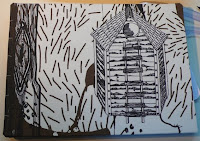
The front cover.

The back cover. The covers are made with a fabric scrap I bought in the Ikea clearance room a long time ago. I bought it with no particular purpose in mind, but knew I would find something eventually. And, so I have. Vindication!

Laying open. Because it's a coptic binding, it opens pretty much totally flat, which is nice. The crease in the standard hardcover sketchbook is problematic. I'd been buying spiral bound for a while, but I don't really love them, they are just a compromise between not opening all the way, and using plain old loose leaves of paper. Which I might do next time.
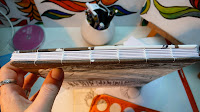
Here's a shot of the spine, in case you were wondering what coptic binding means in practice. Each signature (group of pages) is stitched from the inside to the outside, connecting to the signatures that come before and after it. The first and last signatures are attached directly to the cover boards. It provides exceptional flexibility of the spine, and can also be used for a book of almost any thickness.

This picture shows the inside of the back coverboard, and some of my drafting tools. Not that you really needed to know about that, I just liked the shot.
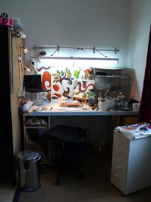

I know it's been a while since I posted the current work in progress, and technically I am not really doing that now. HOWEVER! Here is a picture of my workspace as it sits right at the moment. The panels along the back are the pieces of a custom crate, the center of the desk has a belt buckle design I am finalizing with hopes of begining the actual piece today, and the rack on the right has a bunch of work on paper that needs to be matted, imaged for the portfolio, and filed. Also, some Sequential Tart review materials are there, and my new sketchbook that I made over the weekend.

All the little containers are writing implements, tools, etc. The pink things on the top / left are tape dispensers, which I have needed for a long time. (Yes, it IS "the little things" that make happy happen.)

Little file cabinet is full of more tools / utensils, paints, inks, etc. Trash can on the left, and the cubbies on the desk supports are full of random crap that I need without warning ... but then set aside without warning. It's a functional system, don't judge!

Chair is a swiveling kneeling desk chair. It's not super duper comfortable, but it does save my back and hips. And shoulders and neck. Also, it's really good for keeping my herniated cervical disk from pinching the nerve in my right hand. So ... comfort isn't always immediate gratification.

20 December 2010

I *think* that's finished.

Pretty sure this is done? Haven't sealed it yet, haven't matted it yet. Want to be sure. It's like they say... takes two to make a painting. One to paint it, one to shoot the sumbitch so she'll put the brush down when it's time to stop...

A detail that has been tough to capture in the photo is that the background are off-white silver stripes against the white-white paper. It's much easier to see in the previous post, with the detail shot, but the colors and saturation are pretty whacky with that one.

I'm very pleased with this. It was fun, and although it took about 3x as long as I expected, it is also about 3x cooler than I thought it would be, when I started it. Also, it's plain that all those people who told me I should go into print making were right.

PS, this picture is on the small side, the actual painting is about 6"x20". I'll post a bigger one tomorrow with mo' betta' details, but for tonight, I'm much, much too tired to keep messing with this.

07 December 2010

Time Well Spent


I've been in a lot of waiting rooms lately. I've come to love the sound of someone's eyeball creeping off a back issue of Waiting Room Quarterly and onto my paper.

*creeeeeeeeeeeeeeeeeeeeep*

27 November 2010

Go See The Slide Show on Flickr!


WC11
Originally uploaded by Id Marks
With details, even. Yay!

To see the show - click on THIS picture, which will take you to the Flickr set for these things, and if you click on the first picture THERE, it brings up a nice screen where you can keep clicking next and seeing it all right there.

Let me know if you have questions or comments or are desirous of some art.

Also — I'll make a thing just for you. No need to buy stuff off the shelf. Talk to me.

07 September 2010

Shotgun Updating

Check me out, two posts in one month! It's starting to get crazy around here!

The formatting on these pictures is going to make me nuts if I goof around with it. So I'm not. Here's the rundown.

Couple sheets of paper with barely visible sketches... sketches for my next couple of projects. Hopefully those projects will be visible.

Bunch o' sticks.... if you can guess what tool I made there, you win a prize!* Double prize if you can guess whether it worked or not.

The re-do on the frame / edge. It took much less time than the first time, and is a thousand times better, but I'm still cross to have had to re-do it. Ahh, well. Live and learn. And re-do crap sometimes.

Quick watercolor painting to test out a brush brought from Beijing by a friend who visited there recently. That sucker can lay down some SERIOUS paint! Highly diggable. It will be my go-to brush of choice for watercolor tidal waves.


224214152 - sorry I didn't answer your question sooner, more pictures to come... behind the windows are pigeon holes.... square openings (16cm I think, a bit deeper than that?).

There will be more pictures when I have the front panel opening and closing and stuff.

Yes.


* There is no prize.

24 September 2009

On the other hand...


Actually... the same hand. Hopefully no more hand drawing for a while. By which I mean, oh, ever.

05 September 2009

Proof of Paint 2


I don't like it, exactly, at least not ALL of it, but I believe it gave me a good idea for the next thing. In any case, I'm done picking at it with the paintbrush.

12 August 2009

If at first you don't succeed...

... keep making little disasters until you run out of paper/patience. Figured this was better than posting each one of these individually before they go in the bin. There are about 4 square inches of awesome up there. I maybe cut them out and glue them together. The detail on the pic isn't great, even if you click through, but that's OK, they look better that way. Promise.

04 July 2009

More Kickassery: Patrick Gannon

Making art and illustration from cut up bits of paper... sweet. You'll have to browse around Gannon's website a bit to get the full effect, but I find it to be both charming and delightful.

Patrick Gannon - cut paper art and illustration

11 May 2009

Go see Simon Schubert

Because the embossed paper architecture studies RULE!!

Seriously, check it out.

17 December 2008

completed piece


I have done other stuff since my last post, but this is the first one I remembered to photograph and upload. So.... there you have it.

18 February 2008

Another in this series. I'm starting to think it's time to explore the meaning behind these things. The problem with raw creative impulses is that they often don't make sense. There's nothing wrong with that, but the part of the brain that contributes development and exploration and .... furtherance... needs to know more about what's going on in order to proceed. Otherwise, you just wear a path in the carpet from pacing.

So.... the idea I'm working with here relates to some kind of form emerging from behind a layer of a different material. The emerging forms are rounded, soft (in form and color), and multiple. The covering material is essentially featureless, except where it begins to unravel, jagged and torn. It seems to be pushed back, peeled, cracked.

Cover material: Blank, clean, smooth, damaged, boring?, like skin or sheeting
Emerging forms: Colorful, unanimous, plural (safety/strength/power in numbers?), egg-like, undamaged, perhaps damaging.

See how there are judgment calls mixed in with the descriptive terms? This is what gets at the essence of what's going on in this series. If I were going to actually drill it down to the level of "concept"--meaning, articulate specific values and points of interest about this, I'd probably talk about an examination of the power of collective efforts, about groups overpowering suppression, about interest winning out over homogeneity.

Fortunately, no one has asked me to do that. I find that artists are capable of the loftiest heights of articulation, but also the murkiest depths. Often, concept turns to bullshit in the blink of an eye. It's probably good practice, but I worry that over-analyzing will undermine that raw creative urge. How about a metaphor: Flowers grow best in soil with a fair amount of shit in it, but if the concentration of shit gets too high, your flower will die. Deep, huh? :)

14 February 2008

As Promised

This is another step in the right direction.

I guess one advantage I have in the perpetual struggle to realize visions is this: While my technical skills can improve, the level of detail in my head is not really changing. It's NOT a moving target. Yes, the ideas might become more sophisticated, more resolved, more detailed. But they don't actually become less technically feasible. That remains fairly constant. I assume I'll have finally achieved sufficient ability to execute my visions, when I'm having a heart attack or something at the drawing board. Death does love a good joke.

In related news, I spent some time at the library yesterday perusing the art books. I came across a design book that showed samples of industrial and commercial design, mass production objects, and fashion trends from the 1890s-1990s. I learned a few things from this.
  1. Recreating a period Look is probably not as easy as it seems, given that most of the fashion pictures in the book struck me as being specifically recreations. It's possible that's what those Looks would've looked like if photographed with modern equipment, but somehow I doubt it.
  2. The sailor suit for children came from a portrait of a British prince.
  3. Cubism might've made bad fine art, but it made kick-ass mass production decor.
  4. It's kind of a shame dressing like a grown up is somewhat out of style.
  5. Also, hats.
  6. The late 40s/early 50s American is my favorite lady fashion.
  7. The stove, refrigerator, and sink should not be a single kitchen appliance/fixture.
(What? I don't recall claiming I learned anything DEEP from it.)